

Biorithm
Brand Identity for a brand delivering advanced maternity care
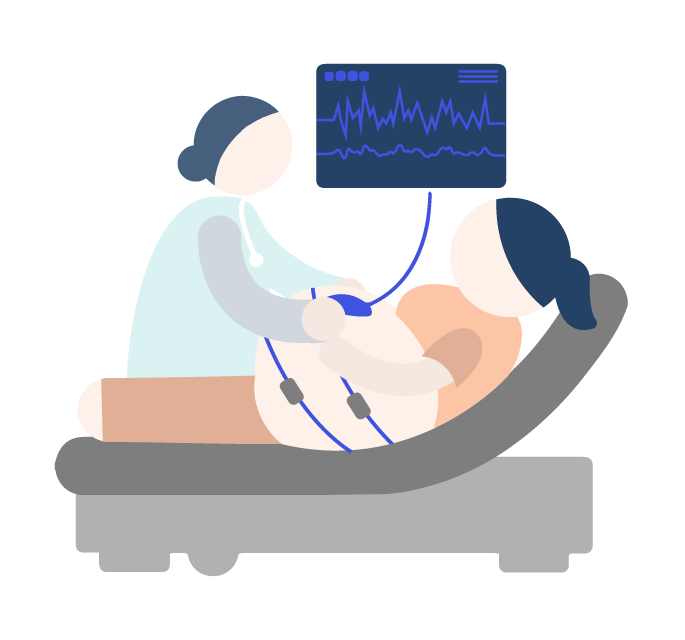
This consumer facing brand empowers women with remote fetal care. With a brand refresh, we created brand consistency through their logo, website, brochures and visiting cards.
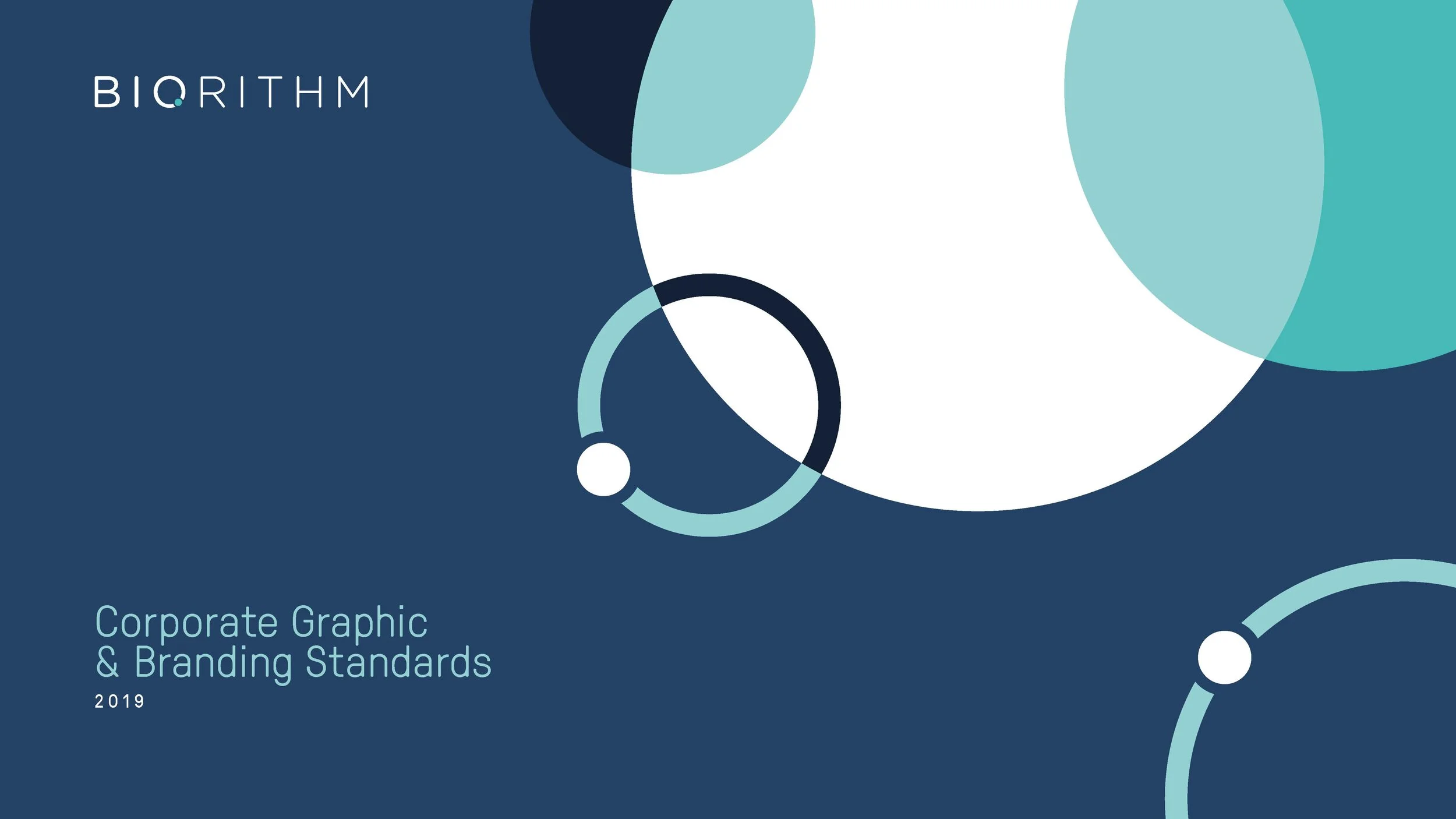
View their brand guide here.

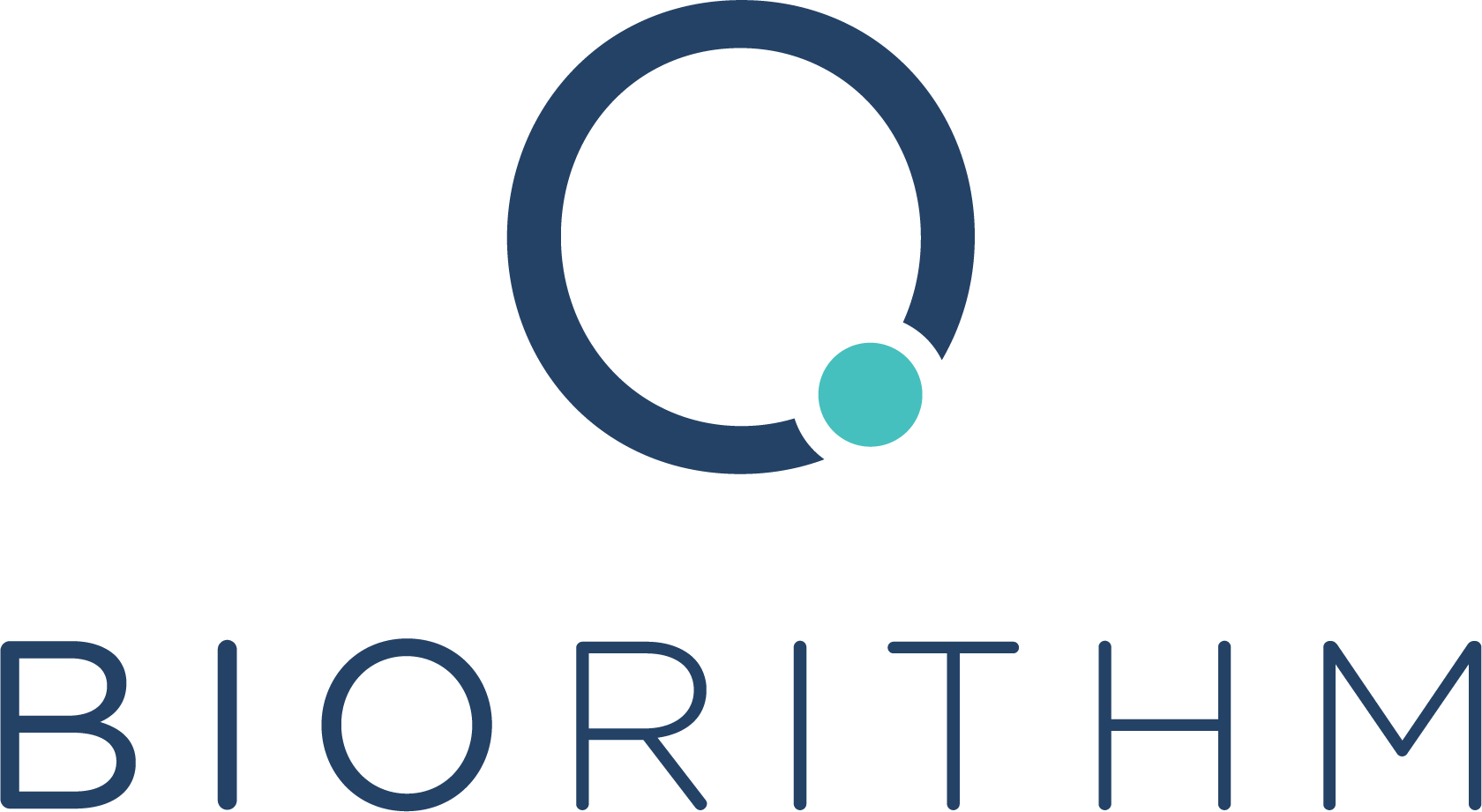

We use a simplified visual mnemonic of a foetus in the womb as a centre point of their logo.
Brochures and posters were slanted to speak with investors and doctors alike.
Keeping their corporate colour scheme in mind, we created soft iconography for their website.