
R-TO-GO
Identity and packaging design for a range of ready to eat meals
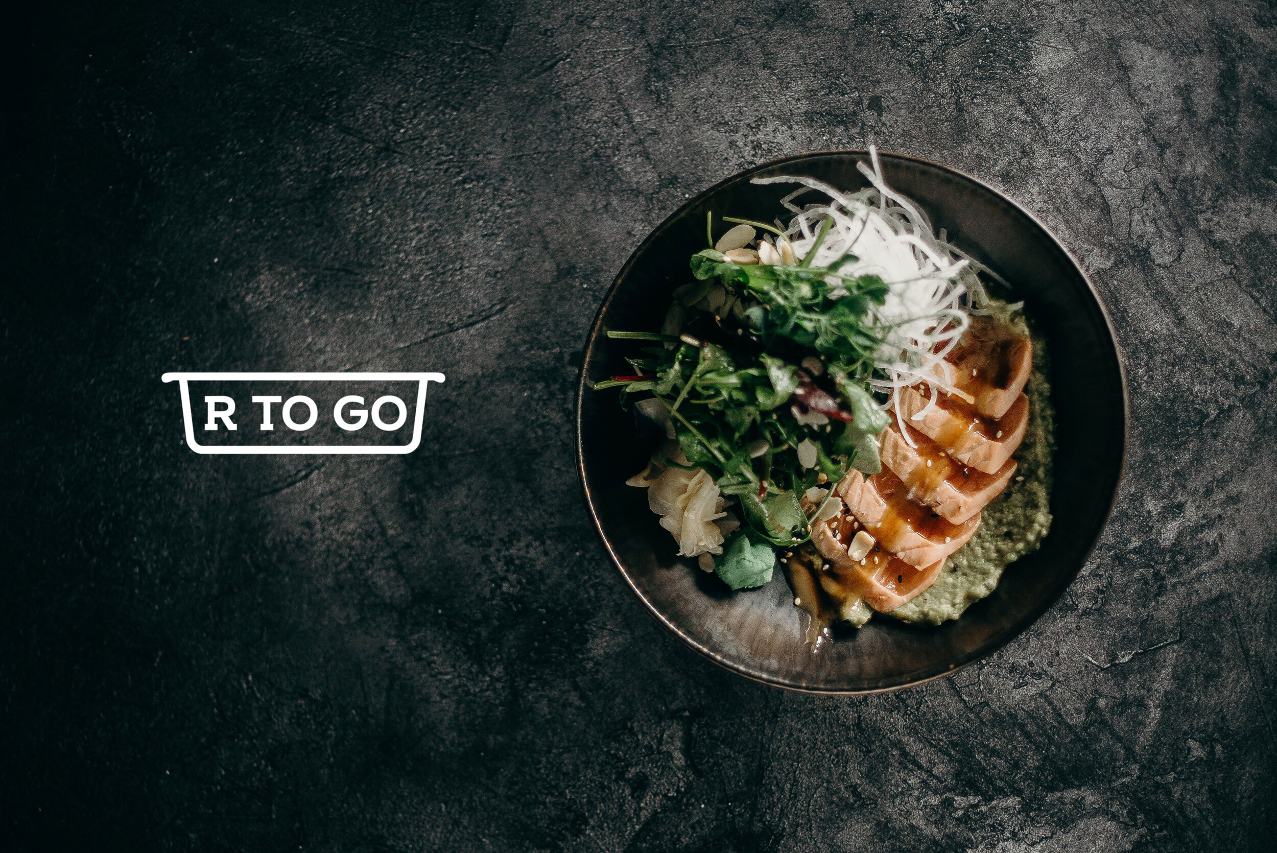
The final identity was inspired by the outline of a dining dish, the shape creates a bounding box around the word mark for an easy to adapt logo on signage, packaging and other application methods. The product packaging graphics use color and a varying tessellation pattern to differentiate between rice, noodles and flavors.

